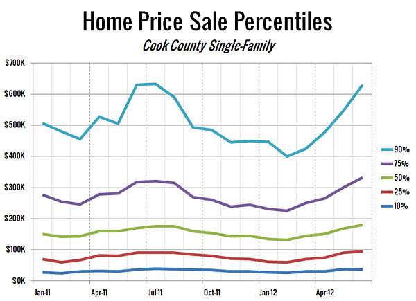
See below for chart description *
There’s a long-overdue ray of hope in the data that Redfin released Thursday: Chicago home prices inched up 0.8 percent from June 2011 to June 2012.
Chicago was one of 16 U.S. cities to notch year-over-year price gains in Redfin’s Real-Time Price Tracker, which looked at 19 big municipalities. While fast-reviving Phoenix’s prices zoomed up by 28.7 percent for the year, and five other cities went up by 5 percent or more, the increase was less than 1 percent in Chicago, Philadelphia, and San Diego.
It’s a very slight improvement, but in the seventh year of the bust, and with Chicago consistently lagging behind other cities as they began to recover in recent months, it counts as a solid sign that we could be climbing back from the bottom of the housing market.
The chart above, which Redfin generated exclusively for Deal Estate, shows that—in Cook County, at least—the upturn was due largely to the sales of higher-priced homes. (There is no reason to think the region’s other five counties behaved substantially differently.) The light blue line at the top tracks prices in the upper 10 percent of the price range for homes sold in Cook. That group’s steep climb in prices since March echoes a report by Crain’s earlier this month that was headlined “the housing crash ends—for some.” There’s been a run of high-end sales, including, by my count, at least a dozen in June that came in at over $2 million.
Redfin’s data also shows a 5.7 percent jump in Chicago prices from May to June 2012, the second highest increase among the 19 cities. “I wouldn’t read too much into the month-to-month changes at any one time,” said Tim Ellis, Redfin’s real-estate analyst. There were four sales at over $5 million in June, and only two in May; each of those superhigh prices has the power to pull up the average quite a bit. On top of that, noting that the light blue line also spiked upward both last spring, Ellis observed that “perhaps the upper ranges are a little more seasonably volatile.”
In the August issue of Chicago, on newsstands now, I reported briefly on some earlier Redfin data that showed that in May, 10 percent of homes on the market in the city sold within 14 days of being listed. The fastest-selling neighborhood was Englewood, where 32.6 percent of listings sold that fast. Most of the quick sales there are foreclosures being snapped up by investors, according to Dario Medina, Redfin’s Chicago market manager. The same is true for Marquette Park (25.2 percent) and Austin (24.1 percent).
But there was also a high proportion of 14-day sales in places where most properties were not distressed. The top three: Hyde Park/Kenwood, (28.6 percent), Lake View (23.8 percent), and Wicker Park (23.1 percent). All three are very desirable neighborhoods where inventory has been tight, which spurs rapid sales when buyers are lurking, watching for attractive new properties to come onto the market.
One key reason inventory has been tight, particularly in Wicker Park, Medina says, is that many homeowners who had bought within the past ten years recently went underwater, owing more on the house than it was worth. “Those are people who would [in the past] have been in a position to sell and move up by now,” Medina says, “but they couldn’t afford to move, so their homes were held off the market.”
But as individual homeowners—usually tutored by individual real-estate agents, Medina says—adjust their expectations downward to meet the price reality of the present-day market, they put their homes on the market priced to move. Realism, then, facilitates a quick sale.
* The chart, prepared for Deal Estate by Redfin, tracks the sale of single-family homes in Cook County between January 2011 and April 2012. The percentages at the right of the chart refer to price ranges. For instance, the light-blue line at the top of the chart labeled 90% represents all homes that sold in the upper 10 percent of all sale prices in the area over that time span; the navy line at the bottom labeled 10% represents all homes that sold in the bottom 10 percent of all prices; and so on. The lines track the lowest-priced house sale within each percentile at a particular point in time.