Graph: Courtesy of us.spindices.com / S&P/Case-Shiller. Thumbnail Photo: Michael Tercha/Chicago Tribune
The S&P/Case-Shiller Home Price Indices are calculated monthly using a three-month moving average. Index levels are published with a two-month lag and are released at 9 a.m. EST on the last Tuesday of every month. The S&P/Case-Shiller U.S. National Home Price Index is calculated quarterly and levels are published in February, May, August, and November, also with a two-month lag. Index performance is based on non-seasonally adjusted data.
The real estate data that has been rolling in this week and last suggests that our housing market’s recovery has been a lot like spring this year: Slow to get here, but surely coming.
Here are some of the most telling morsels in the recent data dump:
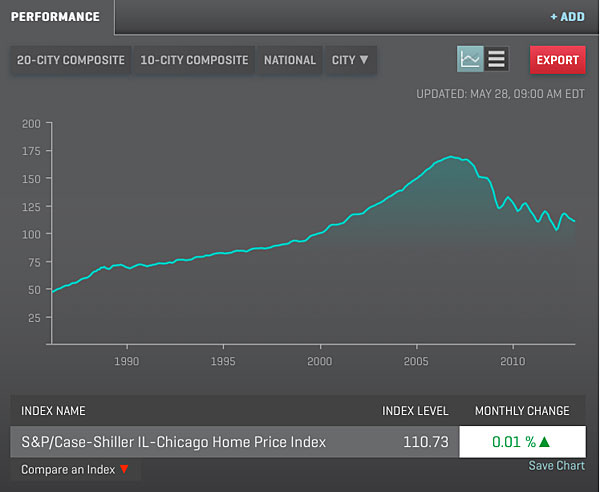
- There was very good news in Tuesday’s monthly release of the Case-Shiller index: Chicago home prices in March were up 7.75 percent from a year before.
- The monthly change wasn’t quite as exhilarating: Prices were up 0.01 percent from February, which is the same as saying they were flat.
- Recovery is good, at any speed. But as I said Tuesday on WBEZ’s The Morning Shift, let’s keep our perspective. That 7.75-percent growth is from March 2012, the month that so far ranks as our lowest point during the boom and after. So while we’re up, we’re not out of the hole.
- And that flat month-to-month figure is also encouraging, since it came after six consecutive months of slight declines.
- That’s another one to keep in mind: although the real estate market was hot and heavy in March, it only managed to stop the slide, not make an uphill turn.
Case-Shiller said the average 12-month increase for the top 20 cities was 10.9 percent. Top-performing cities for the period were Phoenix and San Francisco, each of which saw prices climb by more than 22 percent from March 2012. Six cities came in with lesser 12-month growth than Chicago; the lowest was New York, with 2.6 percent.
By Case-Shiller’s measure, while the national data puts prices at mid-2003 levels, Chicago prices reach farther back. Prices here are about even with where they were in April 2001, almost 12 years ago. (One thing that’s not where it was in April 2001 is our mindset about borrowing to buy a house; that month, the Tribune ran this piece that touted, among other things, the new wave in buying homes with no down payment. Not gonna happen this time around.)

Graph: Courtesy of the Illinois Association of Realtors
Historical Median Sales Price. Click the image to view the full graph.
When you look at how far back our prices have rolled on the calendar, it’s easy to comprehend why, as Zillow reported last week, a little more than half of Chicago-area homeowners can’t afford to sell, regardless of whether their mortgages are underwater. A dozen years of equity has been eaten away, and Zillow calculates that homeowners need at least 20 percent equity to cover a new down payment, taxes and moving expenses.
And to make matters worse, Chicago is one of three major cities where Zillow expects more homeowners to be underwater going into 2014 than were going into 2013.
Affluent people, who often have sources of a down payment somewhere other than in their home (in a stock portfolio, for example), may have been more able than middle-income people to seize on the low prices and interest rates that make this such a great time to buy. The North Shore-Barrington Association of Realtors reported Tuesday that in April, 47 houses on the North Shore sold for $1 million or more, a 46-percent increase over April 2012, when there were 32 big-ticket sales. That's up more than 113 percent since April 2009, when there were 22.
The data for the entire Chicago market, not just the affluent sub-market, looks great for April, too. The Illinois Association of Realtors released data last week showing that the number of sales and the median sale price were up, while the amount of inventory available and the length of time homes spent on the market were both down. All four signal recovery.
But psst: Take a look at the IAR’s chart on Historical Median Sales Price (click on the image, above right), and you’ll see what worries me: Every year for the past several, we’ve ticked up for several months in spring, only to dip again in summer. That’s not surprising: many people have made their end-of-school-year moves, and others may be more focused on late-summer travel than on buying a house. What worries me is a larger trend: each time we’ve gone down, we’ve gone a little lower than the year before.
We may be past that—this year’s drop could be shallower. But fasten your seatbelt anyway.